<< back to all work


Grow.com - Smart Builder & Dashboard Filtering

Grow.com provides BI to help small and medium businesses grow. I lead the design efforts to simplify what is required to get valuable BI. This includes a complete redesign of the Grow Metric Builder, introducing Datasets, a Data Warehouse, and creating new data transformation and visualization tools.


Research & Discovery

This project largely grew out of an extension of the builder redesign. In that project we introduced a few features that made building easier for non-builders. We continue to focus on making data analysis easier for non-technical users.

As we interviewed customers and performed analysis on existing data we found that many users were making the same metrics over and over with a single small change. For example a Sales by week metric, a Sales by month metric, and a Sales by quarter or Sales by team A, Sales by team B, etc. Another issue we found was that non-builders were limited by the insights they can get from Grow. They were only able to see what builders have provided for them. The root of both of these findings was that Grow's metrics were mostly static. Static metrics only answered one question and users who are “consumers” had no ability to ask more detailed questions they may have had.


Guiding Insights:

  1. There was no way for users to perform ad-hoc analysis on their data.
  2. There was no way for users to analyze their data outside the metric building context. This limited the insights they could get and who could get these insights.
 
 
As we consolidated our research findings, ad-hoc analysis emerged as a major category.


Design Idea - Dashboard Filtering & Smart Builder

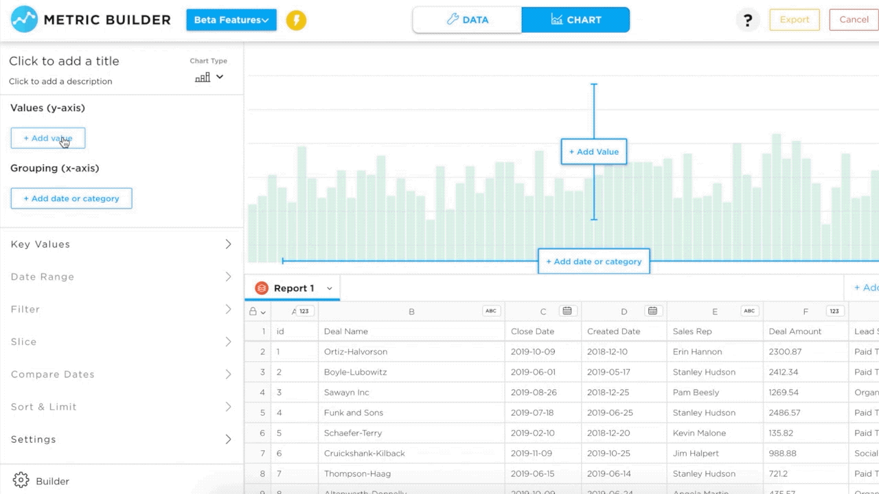
With these insights & guiding principles, we brainstormed & sketched with the product and engineering team. We converged on the ideas of “Dashboard Filtering” and the necessary prerequisite of a builder that supports it, the “Smart Builder”.

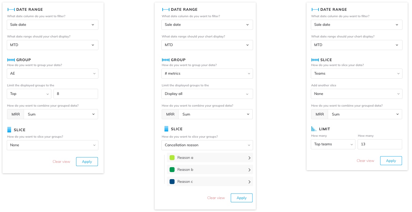
Dashboard Filtering would expose some controls on the dashboard that could enable anyone to look at their data with a different date range, date grouping, or with a filter applied. For example, someone could change the date range of a metric with a drop down or filter a sales metric down to a single sales person.

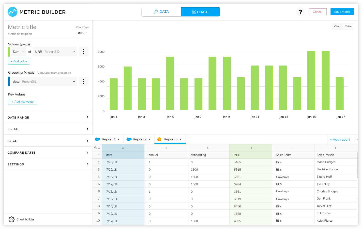
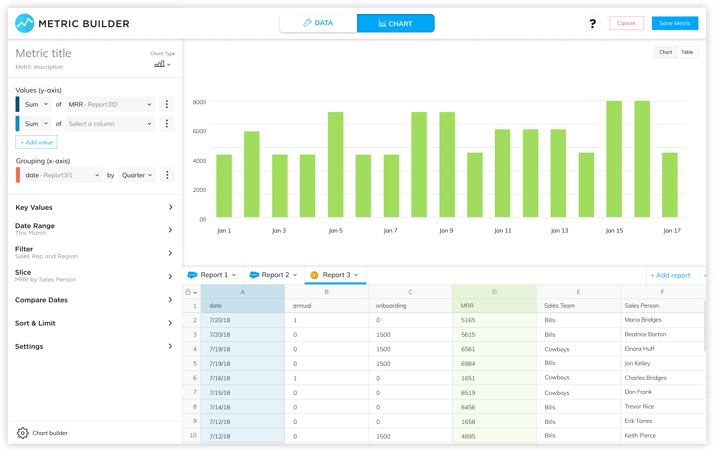
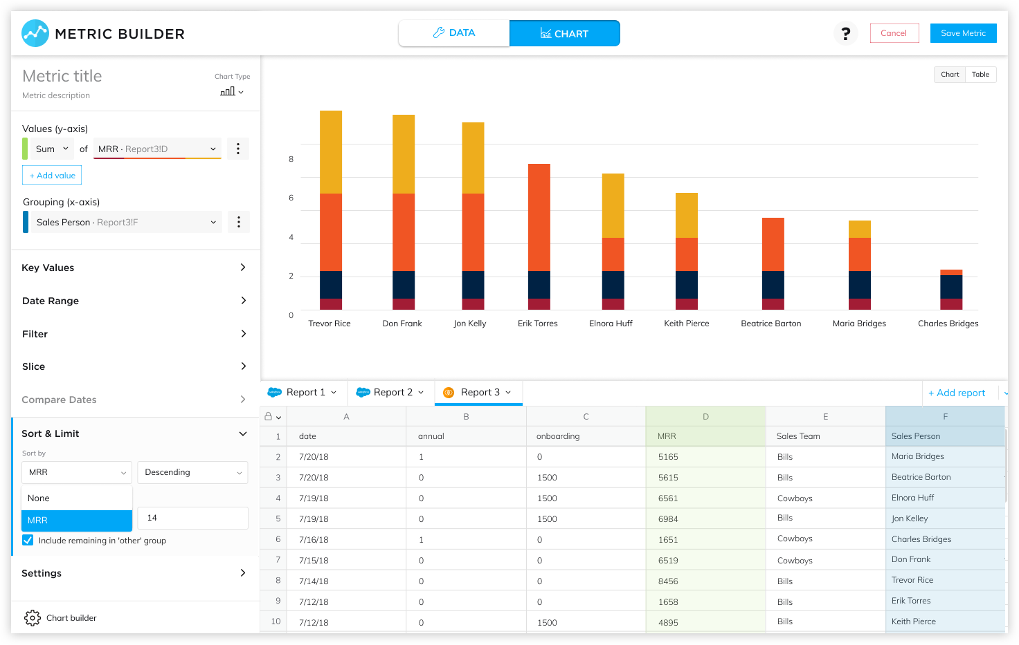
To support this feature, we needed to update how visualizations were made. While a few dropdowns to change a metric seems simple, the data architecture of our metrics did not support that functionality. We needed to re-architect and re-design the visualization process. The existing architecture performed “destructive” transforms. For example, if you grouped your data, Grow only maintained an understanding of the aggregated data, not the transactional data. The new builder, or “Smart Builder,” would need to perform data transformations that maintained all the underlying data.


An earlier feature, Chart Level Transforms, that tested & validated this idea.
 
 
We had previously released a small feature, Chart Level Transforms, testing this idea. This showed the approach we wanted to take was useful to users. However, the feedback we got was that it was not powerful enough to replace the current way of working. Additionally, we learned its location in the UI was confusing and disconnected from users' workflows.


Design, Prototype, & Test

With these insights and learning, we began sketching, prototyping, and testing. We tested extensively with internal users and our customer success team. Through this process, the design became much more usable and we were able to refine features.


In our first designs, we expanded the capabilites of the existing Chart Level Transforms feature. The feedback on this test showed this pattern did not fit how users thought about building metrics. The metric analysis tools were too disconnected from the rest of the metric building.
 
 
We wanted to make the analysis tools fit in the users' typical workflow. We made a prototype to test where each analysis tool belonged in the UI. However, nearly every user we tested with had a different mental model of how these tools worked and where they belonged. In order to address the disparity of expected tool locations, we brought them all out front and center. This immediately clicked in our next round of testing and there was no longer confusion.
 
 
The previous design did not provide enough feedback about the visualizations. A user couldn't tell which analysis transforms were in use. To address this, we added summary statements to each transform.
 
 
The final designs for the Smart Builder with the analysis transforms.


Release, Feedback, & Iteration

As we began to roll this out to our alpha and beta customers, the main feedback we received was the desire for more chart types to be supported. One of the trade-offs we made while developing was to initially support half of our chart types. During Beta, customers asked for support of all chart types, so they could use the Smart Builder for all of their metrics. This was a good sign to us, as users wanted to use the Smart Builder more.

Another piece of valuable feedback we received was more for feedback and transparency around what the builder was doing. The Smart Builder abstracts a lot of complexity from the user, for example through automated calculations. This is a major reduction in complexity for users, but they needed a better understanding of what the builder was doing behind the scenes. They wanted to validate that it was doing what they expected. We made a major effort to start surfacing this information. It has led to a dramatic increase in customer trust and has since become one of our design principles when building a new feature or product.


A demo of the Smart Builder


<< back to all work